Flow Diagram (Sankey)
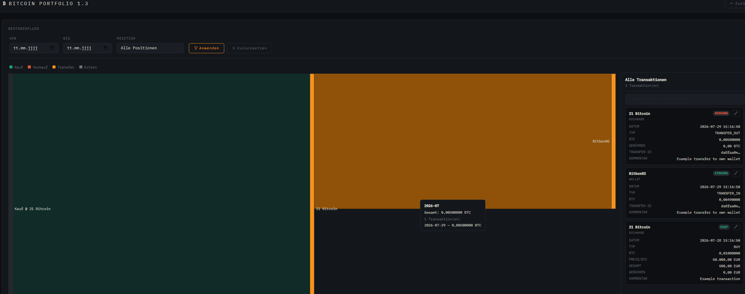
Accessible from the dashboard header via “Visualization” → “Flow Diagram” (or directly at /btc-tracking/flow). It draws a Sankey diagram of how your own BTC has moved over time: purchases flow in from the left, sales and external withdrawals flow out to the right, and transfers between your own wallets/exchanges appear as connections between the position nodes. Bookings are grouped by month and by source/target pair so the diagram stays readable even with a long history.
Filters
| Filter | Effect |
|---|---|
| From / To | Limit the diagram to a time range |
| Position | Anchor the diagram to a wallet/exchange — traces its BTC backwards (origin) and forwards (destination) |
Color Legend
- Buy — BTC purchased into a position
- Sell — BTC sold from a position
- Transfer — moved between two of your own positions
- External — deposit from, or withdrawal to, an address outside your tracked positions
Transaction Panel
Alongside the diagram, a panel shows every underlying booking as a card (date, position, type, BTC amount, price, fees, currency, exchange rate, transfer ID, comment). Buy, sell, and transfer in/out each get a small colored badge. A search field above the list filters by any value visible on the cards (position, type, date, amounts, comment, …) — regardless of whether amounts are entered with a dot or a comma. On narrower screens, the panel slides below the diagram instead of sitting next to it.
Interaction in the Diagram
| Action | Result |
|---|---|
| Hover a node or link | Tooltip with the exact amount, month, position balance, and the list of individual bookings behind it |
| Click a node or link | Highlights it and filters the transaction panel to only the related bookings; the panel title switches to “Filtered: …” with a reset button. Clicking the same element again resets it, clicking another one switches immediately. |
Interaction in the Transaction Panel
| Action | Result |
|---|---|
| Hover a transaction card | Temporary preview highlight of the matching link/nodes in the diagram (only while no diagram selection is active) |
| Click a transaction card | Pins the highlight for exactly this booking in the diagram — without filtering or shrinking the list, and without changing the panel title/count. Clicking the same card again removes the pin, clicking another card switches the highlight immediately. |
images/flowchart.png
Holdings View
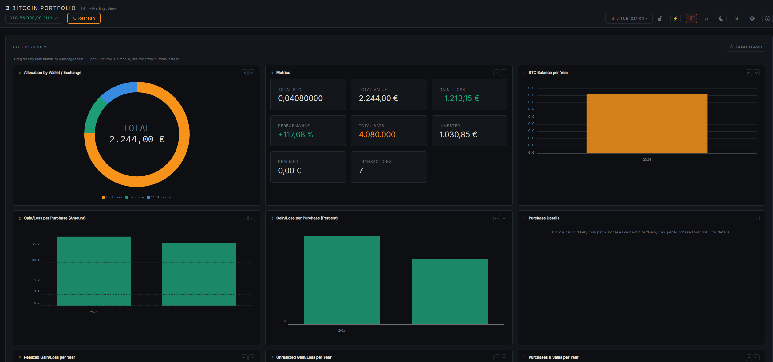
Accessible from the dashboard header via “Visualization” → “Holdings View” (or directly at /btc-tracking/holdings). A full dashboard built from individual tiles, centered on portfolio distribution, key metrics, and yearly performance — including a breakdown down to the level of individual purchases. Like on the overview page, tiles can be freely rearranged by dragging the handle (up to 3 per row, arrow buttons on mobile), and “Reset layout” restores the default arrangement.
Allocation & Metrics
A donut chart shows the distribution by wallet/exchange (share of total value), next to a tile with the central metrics: total BTC, total value, performance in %, holdings in satoshi, invested amount, already-realized gain/loss, total gain/loss, and the number of transactions.
Yearly Charts
Three independent bar charts, one bar (or bar group) per year:
| Chart | Shows |
|---|---|
| BTC holdings per year | Total BTC holdings across the whole portfolio as of Dec 31 of each year (or now, for the current year), in Bitcoin orange |
| Buys & sells per year | Buys, stacked by wallet/exchange (each position its own blue/teal shade), next to a separate Sells bar (purple) for the same year |
| Realized gain/loss per year | Sale proceeds minus the weighted average cost basis of the sold BTC — green for gain, red/orange for loss |
| Unrealized gain/loss per year | Holdings value at year end minus cost basis at that point. Uses the live price for the current year, and the Dec 31 reference price described below for past years — if that's still missing, the bar stays empty |
Gain/Loss per Purchase
Two more charts (percentage and absolute amount) with one bar per individual buy transaction, sorted chronologically. The color combines sign and FIFO status — computed portfolio-wide, which purchase has already been (partially) “consumed” by later sales:
- Held, in profit / held, at a loss — bold color, not yet sold
- Partially realized — muted shade, part of it already sold
- Fully realized — palest, fully sold
Large outliers are compressed (symmetric log scale above ±100%, or a threshold automatically derived from the data for the currency chart) so that a single extremely high or low purchase doesn't shrink every other bar on the axis to invisibility — the tooltip and purchase details still show the real value.
Purchase Details
Clicking a bar in either of the two gain/loss-per-purchase charts opens the corresponding Purchase Details tile: date, position, BTC amount, price, total amount, fees, gain/loss in % and amount, comment — for partially/fully realized purchases, also the individual related sales with the BTC portion consumed from each. Use the arrow keys ←/→ to browse chronologically to the previous/next purchase while a selection is active.
images/holdings.png
Yearly View
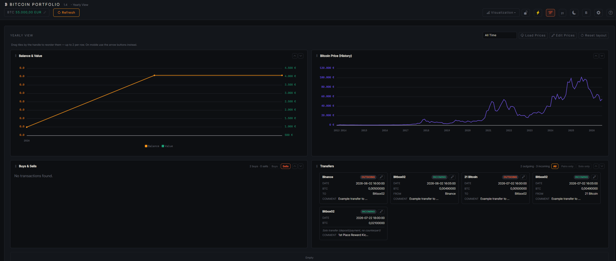
Accessible from the dashboard header via “Visualization” → “Yearly View” (or directly at /btc-tracking/yearly). A selector at the top switches between the overall view and a single year (the choice persists across reloads) — all tiles below adjust accordingly. Here too, tiles can be freely rearranged (up to 2 per row), including “Reset layout”.
Holdings & Value Over Time
A line chart with two axes: holdings in BTC (orange, left axis) and value in the selected display currency (green, right axis) — for the overall view across the full history (year marks on the X axis), for a selected year broken down into its 12 months.
Bitcoin Price (History)
A standalone line chart (purple) with the pure BTC price history in the selected display currency — independent of the transaction-bound time range of the holdings/value chart above, since it shows the complete available monthly price history (or, for a selected year, just its 12 months). “Edit Prices” opens a year-grouped, collapsible dialog for manually entering/correcting individual monthly prices — the current month there always uses the currently stored price automatically and isn't editable.
Buys & Sells
Every buy/sell transaction in the selected period as its own card, with independent show/hide filters for buys and sells. Buy cards show date, BTC amount, price, total amount, fees, and gain/loss in % and amount (including a “Partially/Fully realized” badge). Sell cards additionally break down the composition from historical purchases (FIFO — oldest open purchases consumed first): per consumed purchase lot, the amount, the original purchase date, the holding period in days, that lot's proportional gain/loss, and a tax-free/taxable badge (holding period ≥ 365 days counts as tax-free, unless a cutoff date set in Settings says otherwise — informational only, not tax advice).
Transfers
Deposits and withdrawals (TRANSFER_IN/ TRANSFER_OUT) of the selected period, also shown as cards with date and BTC amount. Three mutually exclusive filters — All, Paired only (transfer between two of your own positions, the counter-booking is found automatically via the shared transfer ID and shown as “From”/“To”), and Solo only (deposit/withdrawal without a counter-booking — the default filter).
images/yearly_view.png
What's here — and what's next
This page is deliberately kept open-ended: every visualization gets its own numbered section up top, and the app's “Visualization” menu already reserves a spot for upcoming chart types alongside the Flow Diagram.
- Flow Diagram (Sankey) — buy/sell/transfer flow over time, with a filterable and searchable transaction panel
- Holdings View — allocation, metrics, yearly buys/sells, realized/unrealized gain/loss, and gain/loss per individual purchase
- Yearly View — holdings & value over time, Bitcoin price history, buys/sells with FIFO lot breakdown and tax badges, transfers
- More visualizations — will be documented here as they become available